Catholics Saints
4.0star
1.17K reviews
50K+
Downloads

Everyone
info

About this app
"The saints expressed in various ways the powerful and transforming presence of the Risen One. They let Jesus so totally overwhelm their life that they could say with St Paul “it is no longer I who live, but Christ who lives in me” (Gal 2:20)." Benedict XVI
The saints are our example that it is possible to reach the sky.
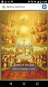
The application includes:
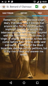
- Saint's history;
- Their prayers;
- Daily phrases;
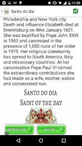
- Saint of the day;
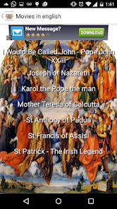
- Catholic movies;
- Exam of conscience.
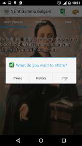
And you can still share a various ways.
Please leave your comments! I am available to respond to criticism, questions and/or suggestions.
The saints are our example that it is possible to reach the sky.
The application includes:
- Saint's history;
- Their prayers;
- Daily phrases;
- Saint of the day;
- Catholic movies;
- Exam of conscience.
And you can still share a various ways.
Please leave your comments! I am available to respond to criticism, questions and/or suggestions.
Updated on
Data safety
Developers can show information here about how their app collects and uses your data. Learn more about data safety

No information available
Ratings and reviews
4.0
1.1K reviews

Joe Esposito (Joey Whisperz)
- Flag inappropriate
April 17, 2021
It's ok

A Google user
- Flag inappropriate
- Show review history
July 14, 2018
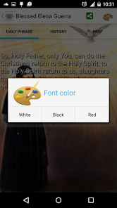
I want to like this, but the font is difficult to read. Perhaps fading the
background pictures would help. The hollow white font on the title pages is
nearly impossible to read. The text fonts deeper in the app are still
difficult (solid white with slight shadowing) due to the bright background
and not much font shadowing.
8 people found this review helpful
A Google user
- Flag inappropriate
January 16, 2017
Excellent
2 people found this review helpful