2.7star
10.7K reviews
1M+
Downloads

Teen
info

About this app
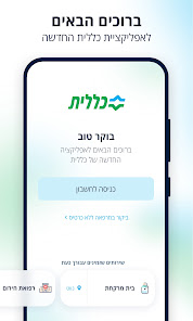
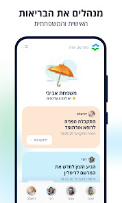
What has changed? Everything! We rebuilt it with an advanced and clean design, a smart and convenient interface
For use and an advanced system that adapts itself just for you.
Here are some of the innovations of the app:
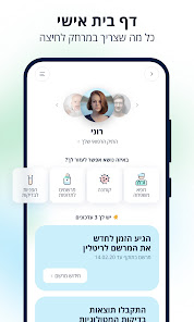
• Helping you manage your health - personal tabs that show you the most important updates and actions to take.
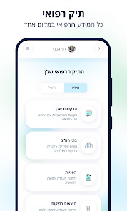
• All services in one place - book appointments, send requests to the clinic, view test results, check inventory in pharmacies and more ...
• Simply log in to the app - identification with a one-time code via SMS, fingerprint or face recognition.
Bye bye to traffic jams and waste of time - quick access to remote medical services and medical consultation services with Tyto
• Focused and comfortable browsing experience - quickly navigate to the various services, remove messages you have already read, get support in other languages as well.
For use and an advanced system that adapts itself just for you.
Here are some of the innovations of the app:
• Helping you manage your health - personal tabs that show you the most important updates and actions to take.
• All services in one place - book appointments, send requests to the clinic, view test results, check inventory in pharmacies and more ...
• Simply log in to the app - identification with a one-time code via SMS, fingerprint or face recognition.
Bye bye to traffic jams and waste of time - quick access to remote medical services and medical consultation services with Tyto
• Focused and comfortable browsing experience - quickly navigate to the various services, remove messages you have already read, get support in other languages as well.
Updated on
Safety starts with understanding how developers collect and share your data. Data privacy and security practices may vary based on your use, region, and age. The developer provided this information and may update it over time.

No data shared with third parties
Learn more about how developers declare sharing

This app may collect these data types
Location

Data is encrypted in transit

Data can’t be deleted
Ratings and reviews
2.8
10.5K reviews

Yuri G.
- Flag inappropriate
April 25, 2023
The new application design is next to unusable. There is no consistent way to locate a common options. Sometimes these options are missing, and it is not possible to find them at all. There is no apparent logic in the arrangement of the information. Basic convenience instruments are missing - for example, there is no possibility to open a new request when you're viewing the list of old ones. Personally I see zero improvement and a lot of extra pain.
32 people found this review helpful

Liora Yuklea
- Flag inappropriate
May 4, 2022
The new app is a great example of mistaking UX for just UI, or 'making things pretty'. It's definitely aesthetically pleasing and aligns to current visual design trends, but falls short on basic UX principles. For example, it launched several months ago and I've been using it frequently - why do I still get the announcement speedbump at the beginning about the new app, that I have to close to get to the actual app? surely you log my visits and can drop that redundant screen after 3 sessions? Also the navigation in the app is confusing. Test referrals aren't organized chronologically, it is not clear that to ask things from my clinic I need to go into the 'my doctor' section - there should be a CTA for doing that explicitly - the categories in the menu aren't clear and there's no quick access to the top/common actions from the side menu, you have to tap through back to the home screen no matter how many screens deep you're in. And if the app cared to have a visible feedback or bug report form of any kind, this feedback wouldn't have to go into it's public Play store review...
97 people found this review helpful

Frezanie Amos
- Flag inappropriate
February 6, 2024
no English translation in this app .They should atleast have english translation for foreigners.
2 people found this review helpful
What's new
חדש מהנילונים - העדכון החדש והטרי שלנו.
והפעם יש לנו כמה חידושים חשובים, כמו:
- כל שירותי הרפואה הדחופה במקום אחד.
- מידע שימושי וחשוב למטופלים שהתאשפזו.
וזה לא הכול - שדרגנו תהליכים, שפרנו ביצועים ונפטרנו מבאגים.
נתראה בעדכון הבא...
והפעם יש לנו כמה חידושים חשובים, כמו:
- כל שירותי הרפואה הדחופה במקום אחד.
- מידע שימושי וחשוב למטופלים שהתאשפזו.
וזה לא הכול - שדרגנו תהליכים, שפרנו ביצועים ונפטרנו מבאגים.
נתראה בעדכון הבא...
App support
phone
Phone number
+97236935988


