
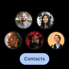
Contacts
4.3star
1.38M reviews
1B+
Downloads

Everyone
info
About this app
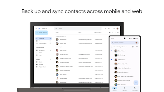
Back up and sync your contacts across all your devices
• Keep your contacts safely backed up to your Google Account
• Access your contacts from anywhere you’re signed in, including your next phone
• Recover contacts deleted in the last 30 days from Trash
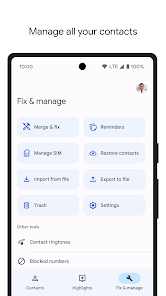
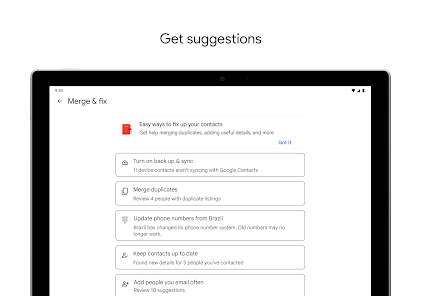
Keep your contacts organized and up to date
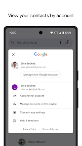
• View your contacts by account (such as work or personal)
• Easily add contacts and edit information like phone numbers, emails, and photos
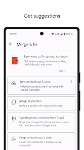
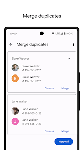
• Get help merging duplicate contacts, adding useful details, and more
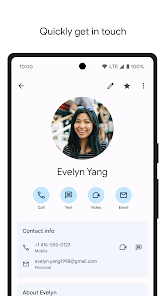
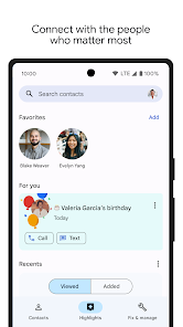
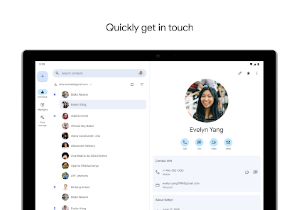
Connect with the people who matter most
• View highlights, like upcoming birthdays and anniversaries
• Add notifications so you never miss a special day
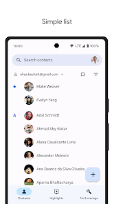
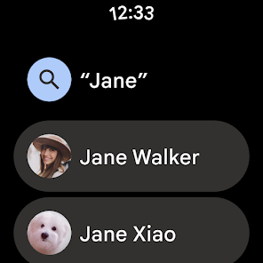
• Easily access contacts you recently added or viewed
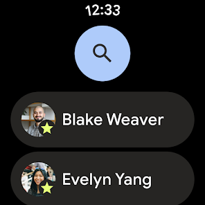
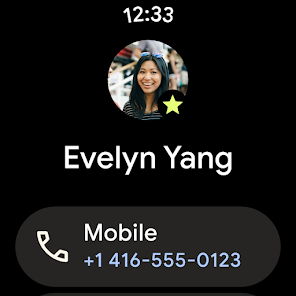
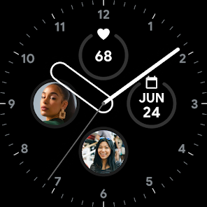
Also available for Wear OS, including a Favorite contacts tile and contact complication
• Keep your contacts safely backed up to your Google Account
• Access your contacts from anywhere you’re signed in, including your next phone
• Recover contacts deleted in the last 30 days from Trash
Keep your contacts organized and up to date
• View your contacts by account (such as work or personal)
• Easily add contacts and edit information like phone numbers, emails, and photos
• Get help merging duplicate contacts, adding useful details, and more
Connect with the people who matter most
• View highlights, like upcoming birthdays and anniversaries
• Add notifications so you never miss a special day
• Easily access contacts you recently added or viewed
Also available for Wear OS, including a Favorite contacts tile and contact complication
Updated on
Safety starts with understanding how developers collect and share your data. Data privacy and security practices may vary based on your use, region, and age. The developer provided this information and may update it over time.

No data shared with third parties
Learn more about how developers declare sharing

This app may collect these data types
Personal info, Photos and videos and 4 others

Data is encrypted in transit

You can request that data be deleted

Independent security review
Ratings and reviews
4.3
1.34M reviews

Edward Ned Harvey
- Flag inappropriate
February 24, 2024
It shows every email address you've ever corresponded with, not just what's actually in your contacts list. Cluttered up the view, and doesn't seem to be any way to fix that. Their support email has an auto responder saying they don't read it, gives you a support URL where you can only search. No ability to ask questions, not even a community forum.
1,044 people found this review helpful

Robby Bennett
- Flag inappropriate
January 30, 2024
Same problems since 2017 or earlier. The contact photo is too big. It takes up the top half of the screen, and the keyboard takes up the bottom half. The best use of the screen would be name, phone, email, address, etc. There must be an option to hide the giant contact photo, or at least make it smaller. There should be settings to simplfiy the contact creation screen by hiding and ordering fields.
2,646 people found this review helpful

Mike Mellott
- Flag inappropriate
- Show review history
January 10, 2024
The Contacts button is useless, so is the Higlights button. The Fix & Manage button should be a menu item. Just show my contacts list when I open the app. No need for a dedicated bottom bar for this. It's a complete waste of space. New contacts fields show Significant Date and Birthday but you have to click More Fields to enter an address. On Pixel Watch it doesn't show the address, or any field besides phone number, so you can't use it for navigation to an address.
4,234 people found this review helpful


